Featured Project: Camphill Ghent, Chatham, NY
Click here for a slideshow of the images below.
(For another featured project, a residence in Lenox, MA, click here.)
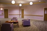
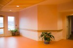
An important feature of the Camphill Ghent community is the co-location of independent living townhouses and apartments, a licensed Adult Home, and a traditional Camphill Community household for individuals with developmental disabilities. The diversity is intended to provide a rich and ongoing source of potential relationships for all community members. These relationships may result in friendships, practical mutual support, and shared participation in the cultural and social activities of the community.
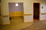
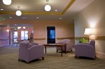
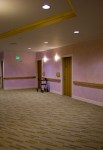
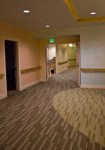
These photos are taken of areas in the two Adult Homes. Color plans for the entire community were developed by Robert Logsdon. The common areas of these two buildings and areas of the Co Houses were lazure painted by a team working with Robert.
The lazure color transitions allow for a gradual color change throughout the spacious hallways which open into large sitting or activity areas. Also, lobbies, cafes, dining rooms, and therapeutic rooms were included in the project and bathed in transparent color.


Back to top
Featured Project: Residence in Lenox, MA

Lenox, MA
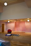
The living room/dining room of this Lenox, MA home is painted with layers ranging from yellow ochre to deep burnt orange to sienna tones. The deep tones are warm and inviting without being too stimulating. The featured ceiling is constructed on a wave form, and is lazure painted with water-like colors of blue and yellow-orange movements, reflecting the colors of the swimming pool outside, seen from the window and balcony. Being much lighter than the walls, the ceiling also reflects light into the room. The orange sienna walls complement the dark furnishings and turquoise glass folding doors. The entire effect is formal yet relaxing.
The room opens on one side to a stairway leading down to guest rooms and recreational areas. The walls are golden and yellow ochre, creating a sunny mood. The ceiling here is viridian (light bluish green) which complements the yellow ochre walls and relates to the main entrance’s blue-green tones. The door leading to the master suite is bluish green glass and served to inspire the colors for the house entrance and stairway ceiling.

Lenox, MA
On the opposite side of the living/dining area, sliding glass doors open to the kitchen and casual sitting area. Here we are greeted by a light-filled, two-story space of pale rose and yellow, creating a cheerful and tasty environment. The trim is a raspberry color. The overall “peachy” effect feels as though it were the fragrance of the main dish being prepared.
Back to top
